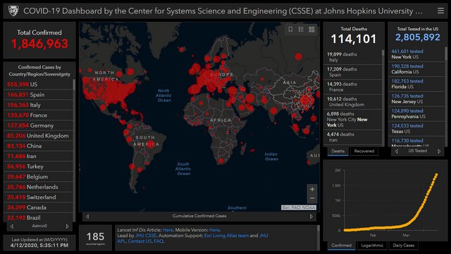
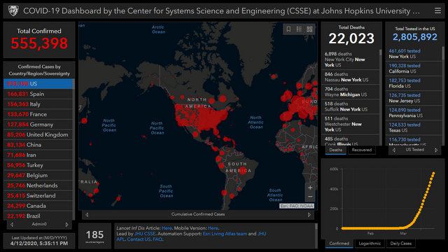
Baltimore, MD…The latest from the Coronavirus dashboard from Johns Hopkins University. As the infections start to soar in North American it tells the magnitude and spread of the problem. If you dig into it you can see when a country peaked and when they started the recovery phase. It is a great source for actual data including those who have recovered. Just click the image below…


How many deaths for California so far? thank you